CSS Media Queries for iPhone & iPad Responsive Designs
 Zubi
Posted On February 1, 2015
Zubi
Posted On February 1, 2015
I’ve been trying many times to make responsive websites targeting specific devices with CSS media queries techniques. And all the time I’ve learn many new ways to fix the stuff and make my clients / customers happier.
You may not believe these just simple piece of codes can make your customer happy and make you happy with coding as there no pain in head after fixing css responsive design issues. That’s why I ended up with this complete media query guide to help you in future projects. I just have posted these media queries to save your some time searching.
iPad Media Queries (All generations – including iPad mini)
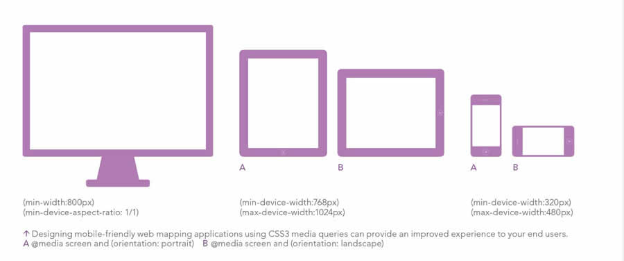
These are the queries specially written for Apple devices, all 5 different iPads (iPads 1-5 and iPad mini) can be targeted with just one CSS media query. Below few lines must perfectly work for responsive design.
iPad in portrait & landscape
@media only screen
and (min-device-width : 768px)
and (max-device-width : 1024px)  { /* STYLES GO HERE */}
iPad in landscape
@media only screen
and (min-device-width : 768px)
and (max-device-width : 1024px)
and (orientation : landscape) { /* STYLES GO HERE */}
iPad in portrait
@media only screen
and (min-device-width : 768px)
and (max-device-width : 1024px)
and (orientation : portrait) { /* STYLES GO HERE */ }
iPad 3 & 4 Media Queries
You may want to tarket only 3rd and 4th generation Retina iPads (or tablets with similar resolution) to add @2x graphics, or other features for the tablet’s Retina display, use the following css media queries.
Retina iPad in portrait & landscape
@media only screen
and (min-device-width : 768px)
and (max-device-width : 1024px)
and (-webkit-min-device-pixel-ratio: 2) { /* STYLES GO HERE */}
Retina iPad in landscape
@media only screen
and (min-device-width : 768px)
and (max-device-width : 1024px)
and (orientation : landscape)
and (-webkit-min-device-pixel-ratio: 2) { /* STYLES GO HERE */}
Retina iPad in portrait
@media only screen
and (min-device-width : 768px)
and (max-device-width : 1024px)
and (orientation : portrait)
and (-webkit-min-device-pixel-ratio: 2) { /* STYLES GO HERE */ }
iPad 1 & 2 Media Queries
If you want to implement different graphics for different resolutions such as lower res. the below queries may help you.
iPad 1 & 2 in portrait & landscape
@media only screen
and (min-device-width : 768px)
and (max-device-width : 1024px)
and (-webkit-min-device-pixel-ratio: 1){ /* STYLES GO HERE */}
iPad 1 & 2 in landscape
@media only screen
and (min-device-width : 768px)
and (max-device-width : 1024px)
and (orientation : landscape)
and (-webkit-min-device-pixel-ratio: 1)  { /* STYLES GO HERE */}
iPad 1 & 2 in portrait
@media only screen
and (min-device-width : 768px)
and (max-device-width : 1024px)
and (orientation : portrait)
and (-webkit-min-device-pixel-ratio: 1) { /* STYLES GO HERE */ }
Targeting the new iPad mini with CSS off-course not difficult since these queries are available. Apple has really provided easier ways to developers and gave the iPad mini the same resolution as the iPad 1 and 2.
Now developers can comfortably target all iPads with small piece of code, but it also means there is no way to specifically target an iPad mini with pure CSS. In other words, nothing is new, and you might want to make your text a tiny bit bigger.
iPad mini in portrait & landscape
@media only screen
and (min-device-width : 768px)
and (max-device-width : 1024px)
and (-webkit-min-device-pixel-ratio: 1)  { /* STYLES GO HERE */}
iPad mini in landscape
@media only screen
and (min-device-width : 768px)
and (max-device-width : 1024px)
and (orientation : landscape)
and (-webkit-min-device-pixel-ratio: 1)  { /* STYLES GO HERE */}
iPad mini in portrait
@media only screen
and (min-device-width : 768px)
and (max-device-width : 1024px)
and (orientation : portrait)
and (-webkit-min-device-pixel-ratio: 1)  { /* STYLES GO HERE */ }
iPad mini Resolution
Screen Width = 768px (CSS Pixels)
Screen Height = 1024px (CSS Pixels)

Screen Width = 768px (Actual Pixels)
Screen Height = 1024px (Actual Pixels)

Device-pixel-ratio: 1
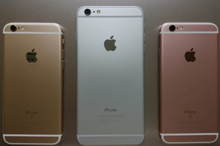
iPhone 6 Media Queries
iPhone 6 in portrait & landscape
@media only screen
and (min-device-width : 375px)
and (max-device-width : 667px) { /* STYLES GO HERE */}
iPhone 6 in landscape
@media only screen
and (min-device-width : 375px)
and (max-device-width : 667px)
and (orientation : landscape) { /* STYLES GO HERE */}
iPhone 6 in portrait
@media only screen
and (min-device-width : 375px)
and (max-device-width : 667px)
and (orientation : portrait) { /* STYLES GO HERE */ }
iPhone 6 Plus Media Queries
iPhone 6 Plus in portrait & landscape
@media only screen
and (min-device-width : 540px)
and (max-device-width : 960px) { /* STYLES GO HERE */}
iPhone 6 Plus in landscape
@media only screen
and (min-device-width : 540px)
and (max-device-width : 960px)
and (orientation : landscape) { /* STYLES GO HERE */}
iPhone 6 Plus in portrait
@media only screen
and (min-device-width : 540px)
and (max-device-width : 960px)
and (orientation : portrait) { /* STYLES GO HERE */ }
iPhone 5 & 5S Media Queries
iPhone 5 & 5S in portrait & landscape
@media only screen
and (min-device-width : 320px)
and (max-device-width : 568px) { /* STYLES GO HERE */}
iPhone 5 & 5S in landscape
@media only screen
and (min-device-width : 320px)
and (max-device-width : 568px)
and (orientation : landscape) { /* STYLES GO HERE */}
iPhone 5 & 5S in portrait
@media only screen
and (min-device-width : 320px)
and (max-device-width : 568px)
and (orientation : portrait) { /* STYLES GO HERE */ }
iPhone 2G, 3G, 4, 4S Media Queries
It is so good as these media queries are also the same for iPod Touch generations 1-4.
iPhone 2G-4S in portrait & landscape
@media only screen
and (min-device-width : 320px)
and (max-device-width : 480px) { /* STYLES GO HERE */}
iPhone 2G-4S in landscape
@media only screen
and (min-device-width : 320px)
and (max-device-width : 480px)
and (orientation : landscape) { /* STYLES GO HERE */}
iPhone 2G-4S in portrait
@media only screen
and (min-device-width : 320px)
and (max-device-width : 480px)
and (orientation : portrait) { /* STYLES GO HERE */ }
iPhone 5 Resolution
Screen Width = 320px (CSS Pixels)
Screen Height = 568px (CSS Pixels)

Screen Width = 640px (Actual Pixels)
Screen Height = 1136px (Actual Pixels)

Device-pixel-ratio: 2
iPhone 4/4S Resolution
Screen Width = 320px (CSS Pixels)
Screen Height = 480px (CSS Pixels)

Screen Width = 640px (Actual Pixels)
Screen Height = 960px (Actual Pixels)

Device-pixel-ratio: 2
iPhone 2G/3G/3GS Resolution
Screen Width = 320px (CSS Pixels)
Screen Height = 480px (CSS Pixels)

Screen Width = 320px (Actual Pixels)
Screen Height = 480px (Actual Pixels)

Device-pixel-ratio: 1
You may also like