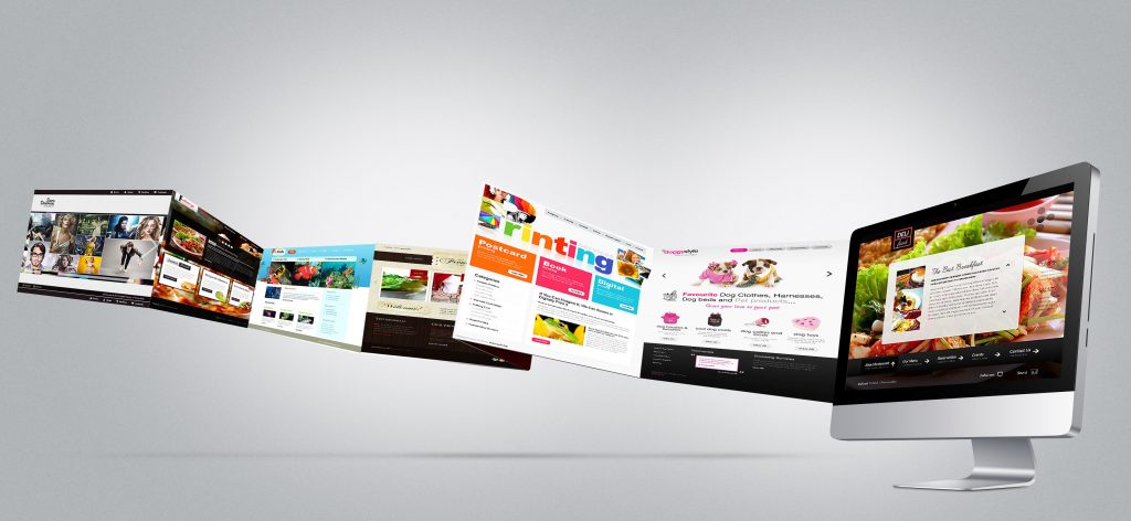
Creating a website is a difficult task. Of course today there are tools that can create sites almost automatically. You can even create a simple “save as …” in Word. Creating a website professionally instead requires many skills: from graphic design to programming, through communication and marketing. Of course for large projects can be isolated roles, but who will take care of the coordination should be aware of this.
In the course of my experience and thanks to the study of some books I would outline a few simple rules: Maybe I wrote stupid things, but I am sure that with your help we can create a list of non-trivial. Incidentally web design is still design: some rules for me are general.
1) Do not feel arrived and did not stop studying
I think I’m not too bad as a web designer, but also as a designer in a general sense (we always talk about computer graphics). But I think it also does not have big creative talent. As I reached a reasonable level of Studying!
I am convinced that in the world of design, especially the web, there are two distinct families: the creative, the real ones that with two mouse clicks create pure art, and scholars, those that compensate for the lack of an innate creativity with the study.
A creative without study, especially the web, has no escape routes: either there is a “translator / adapter” or sooner or later falls submerged by the critical gap and usability. A scholar can not aspire to become a true artist, but it sure can create good jobs or work at least visually correct and pleasant.
Studying in the web design means access to all the literature imaginable, and also copy copy copy. My starting point was absolutely the best book to create the foundations of design The Non-Designer’s Web Book of the great Robin Williams. Already in its third edition allows you to enter the front door into the world of theoretical creativity: guidelines, grids, patterns, fonts … in short, a true spelling book for your design knowledge. If you wish to deepen the entire production of Robin surely will not hurt.
One of the best exercises if you are a beginner is to try to (re) do third party sites. Search the web rankings of the most beautiful sites, or sites that sell the templates. A nice screenshot and work. Begin to understand how to arrange items such as trim them, how to make HTML lightening graphics and arranging them in an optimized way.
Important in web design is that you start to have a critical eye: to criticize and be criticized is good. Take a random site, maybe you could use stumbleupon for this, and started to criticize it: maybe get some notes, marked the strengths and weaknesses (graphics and navigation). Maybe you share your impressions in some social and understand if they are shared or not.
2) Budget & Target
We are doing first job? Or are we already a going concern? These two words Budget and Target must always be present in the header of every job that we are going to do. You can not move without otherwise you burn yourself.
If you are self-employed, of freelancing, you have probably, at least in your head, a kind of price list.: Then sell your product as best as you want, but you have to understand the extent of the cost of what you are haggling! We put 20 hours to make a template? Perfect: Your hourly rate multiplied by the virtual and try to understand in the evening, your children will eat bread, salami or salmon!
Secondly you need to know the target, but it would be better to define the target. Analyze well, “the customer” and his real intentions. Also try to see if you can put your experience in his service, or if you need to restrict yourself to “draw”.
A great thing to have a checklist that starts from the target and ends up in the details. An example:
- what it means to the site?
- to those who want to say?
- what are the competitors?
- What allows users to make the site?
- how much time you devote to the construction site / budget?
- how much time you devote to the site maintenance / budget?
3) The blank page syndrome
For a designer, unfortunately, creativity is an uncontrollable variable. There are days when you are special days when the muzzle slams roofs lean against to the monitor, usually white or with the squares to indicate the transparency of nothing?
What to do? Well it’s not like when you fall asleep and Daniel advised to get up a few minutes, maybe eat something. The good web designer is the same: instead of pasta or cookie we feed on desing in all its forms: connect to MTV or watch advertising institutional LA7. Start to surf foreign sites or head in rankings of the best Russian designers. Browse MAXIM rather than RIDERS . But do not refuse to spuciare on : the important thing is that you do not make the photocopiers.
It may also happen that budget and needs will bring you to consider how best the purchase of a template already nice that done, ready to be filed according to your needs: colors, fonts, titles, …
Take a look at the competitors, however, can be very risky, the risk of “plagiarism in good faith” is upon us. Best to avoid, even better look at them to do something different: the idea of a mash-up is not bad but as I said should be done in a very clever.
The game of words
Another technique that you can adopt is what I call a game of words. Take the keywords of the site, write it on a piece of paper plants. Then started to fly with the fantasy and write concentrically around words to heart the words that come to mind, even those without sense.
The example of the brainstorming of words, after the layout, do not throw it: it will sap your SEO tasks !
4) Logos, colors and icons
If your client is already equipped with good quality logos you are already very lucky people and the work has started very well. If you do not have anything ready and available (€?) There is much work to do, but also a lot of satisfaction that awaits you at the finish line! If you have ugly logos and also wants to use them, and even worse because maybe designed them in 1823 his wife or daughter … well then I suggest you jump on VDM .
The recognition of a site is important. The logo must be recognizable and the site accordingly. The maximum is able to create an iconography, made up of decorations and place cards, able to draw the attention of users and recall the main logo. It ‘hard work, I know, but they pay us (not always) for this.
As for the colors you absolutely have to answer the chromatic of the existing logos and ideas of the client. What you can do is to recommend a good road. What I recommend is to use a limited number of colors in the good relationship between them: 3, 4 colors can be sufficient otherwise you risk to intoxicate the customer. It ‘clear that I speak of an indication sui generis. As Robin correctly
A rule is not complied with the will to do so is creativity!
If there is a good reason why the site has 120 colors is right to do so. If you need to make a site backhand because you are conscious of what you are doing, and not because you are a pirloni, then it is a great job!
5) Decorations and fonts
When you create the design of a site to study the font to be used is of the utmost importance. We know that the web we have a limited number of standard characters, but that does not mean always use those. I have already written about the font for the web and I repeat that, in any case, we can push on target font with reduced if our site grants us know, maybe providing alternate characters in the CSS standard, ensuring that both the browser / operating system do it for you.
Online you can find many services that allow you to replace the HTML text on the fly, turning it into images with the character you want. Personally I’m not very accustomed to this kind of script: I think that if some short text requires special emphasis, you can still use a good one. Gif with ALT and TITLE correct.
One thing to be avoided is the font, or throw at random in different site types of characters. I have seen sites with 3 types of securities with 3 different types of fonts, icons with other fonts yet, ineligible header with decorative fonts … help! Boys 99% of the sites that we are going to develop serve to disseminate and be read. We help the eyes of our sailors to rest on the words, invite them to read and avoid the effect Rotten (dot) com. We are looking for a way coordinated and elegant.
We avoid being banal and avoid in graphic headlines or logos in the usual Times New Roman or Arial. The web is full of free resources with thousands of fonts at your full disposal: sometimes just a detail or a hook in more to make a special inscription. I always use dafont.com , great site with hundreds of resources and well usable. We advise you to always read the disclaimer to use the font.
To help you in choosing the font then I recommend to install a program of browsing fonts, ie a font browser with preview. I use the good old Amp Font Viewer : If you want Geekissimo has made a review complete. One of its potential is to make you a nice preview of all the fonts installed, or only the categories you completed. For example, I have a category Decorative full font nofont (aliens, animals, symbols, …) then you’ll understand why!
Do you know what are the decorative fonts? And the vector graphics? So many times go crazy looking for clip-art vector and we forget that the fonts are the best vector form can be found (if they are done well).
Enrich your site with a personalized touch, but I recommend you do not go overboard in the Baroque or kitsch, as it is absolutely necessary!
Conclusion of Geeksvilla
I wrote a bit ‘of steps to follow, but as I have stated guidelines are very personal. The study, analysis, design, enrichment and the details are still developmental milestones, regardless of the type of activity. I am awaiting your comments and maybe share your personal guidelines for web design also help others.
You may also like